The problem
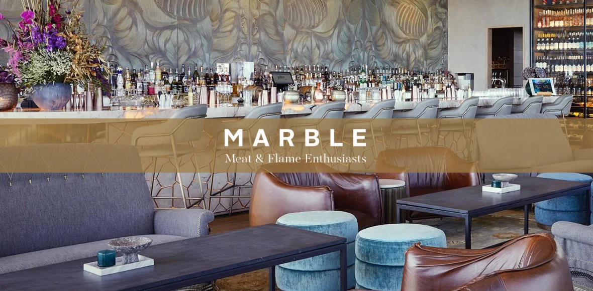
When the manager of Marble Restaurant in South Africa offered us the project, the website's design and development were a mess. It was created by a team member at first, resulting in a very basic site that was hurried to launch. The difficulties were multiple, including an ugly design that failed to convey the basic concept of the restaurant, performance shortcomings, and an overall lack of professionalism. The client desired a major redesign to change the website into a modern, user-friendly, graphical online platform to increase the restaurant's website traffic and customer experience.
Our analysis
Our experienced team performed an intensive review of the website's development, analysing many technical elements such as UI/UX, content quality, SEO, security measures, and overall performance. The present state of the website fell short of modern standards. It lacked appealing designs and mouth-watering graphics of delicious food items, many of which are necessary for attracting and keeping visitor attention.

The solution
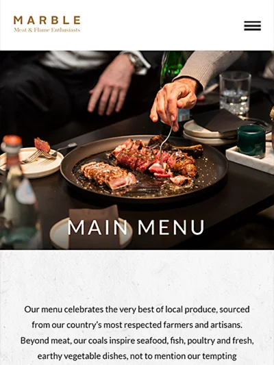
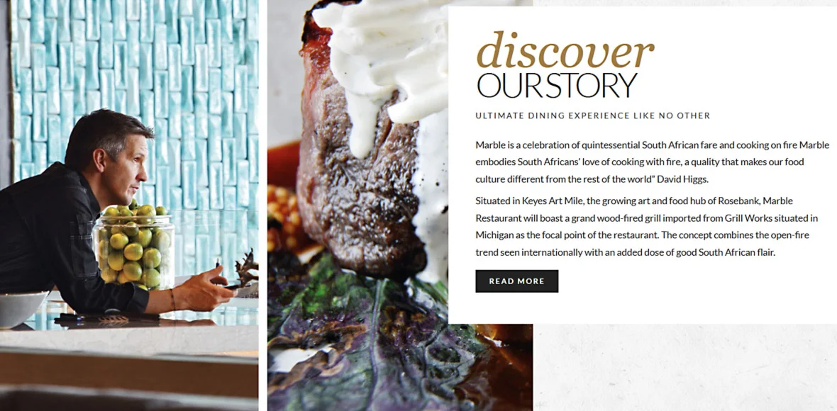
We provided a full website redesign strategy that included attractive layouts and attractive illustrations of the tasty food. We planned to change the website into a bright engaging platform. We tried to not only to meet but go above the users needs through better UI/UX, upgraded content, better SEO techniques, and increased security policies.
Our professionals performed a complete revision, including new elements for exciting user interaction and a unique style. They improved the site's structure, added attractive pictures, and selected material to increase engagement. We planned to establish a digital area that represented the client's cuisine professionalism.

The results
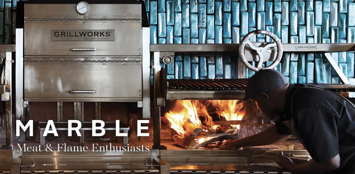
The completed website matched the manager's target, with appealing UI/UX and an eye-catching design. We observed increased audience visits, representing the website's excellent content and performance.


