
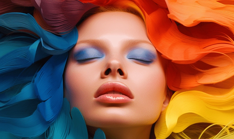
In the digital marketing environment, marketers put all their efforts into influencing the purchase decisions of their target audience. In this process, color psychology plays a major role in compelling or resisting the target audience to buy your products or services. The first section of this article is about understanding the psychology of colors in marketing and how each color arouses a certain emotion. The next section will discuss how to choose the best color for your brand, that will resonate with your target audience.
Understanding Color Psychology
Colors are strongly connected with the emotions and psychology of human beings. They have the power to evoke certain feelings in them. Based on those feelings, consumers make purchase decisions for a product or service. The following table shows how each color is associated with specific emotions and which types of businesses mostly use them.
| Colors | Associated emotions | Mostly used by |
|---|---|---|
| Red | Passion, excitement, energy, happiness | Restaurants and fast-food chains |
| Blue | Calmness, reliability, trust, professionalism | Tech companies, healthcare institutions, and banks |
| Green | Health, sustainability, growth | Eco-friendly and wellness companies |
| Black | Authority, sophistication, luxury | High-end luxury brands |
| Yellow | Creativity, happiness, optimism | Food and Children's brands |
| Orange | Fun, cool, innovative | Food and beverage brands |
| Pink | Sweetness, love, feminity, softness | Women's clothing and accessories brands |
Choosing the right colors for your brand
Choosing the color palette does not mean picking up the colors of your choice. It should represent your company and its offerings as a whole. Now that you understand which colors evoke specific emotions and which brands mostly use them, clear your mind and start working on it. Consider the following factors while choosing the right palette for your brand:
1- Establishing Brand Personality
Before jumping to choosing the colors, stop for a minute and identify which colors resonate with the identity, vision, and personality of your brand. Also, analyze which characteristics appeal to your target audience. Indulge in a brainstorming and mind-mapping session that helps you identify key characteristics of your brand. Here, it is important to collaborate with the branding team and ensure choosing the colors that help your target audience recognize your brand.
2- Cultural Consideration
Simply following the trend and choosing the branding colors blindly may cost you if you ignore their cultural meanings. Ensure that your target audience resonates positively with the choice of colors in all your graphic design materials. As colors have different meanings in different cultures, it is important to conduct thorough research before finalizing. If you are planning to start branding in Christchurch, do not forget to learn about the cultural meaning of colors in your region.
A color that is considered a sign of luck in one culture may be considered a sign of mourning in another culture. If we take a real-life example, Chinese culture considers the color red as a sign of good fortune and energy. On the other hand, this same color is a sign of danger in the Middle East. The West considers the white color as a symbol of happiness, while in Asia, it is associated with sadness. This is how you ensure your brand connects with your audience.
3- Creating Contrast and Hierarchy
After establishing personality and analyzing cultural considerations, it’s time to create contrast and hierarchy. It helps in communicating the brand message and gaining user attention effectively. Contrast means the difference in saturation, brightness, or hue between the branding elements. Here, you decide which elements you want to stand out and which to keep in the background.
Utilizing contrasting colors can help you gain your target audience’s attention toward important branding elements such as a logo, a tagline, and a call to action. On the other hand, organizing branding elements in the order of importance is what hierarchy is about. Here, we use color hierarchy to dominate the colors of primary elements. This way, you ensure to communicate your message and identity to your audience to gain their attention.
4- Testing and refinement
Creating effective branding colors requires testing and refinement. Testing helps you gather valuable feedback from the target audience and analyze the impact of the color palette. You can go for A/B testing and compare the performance of various color palettes. This way, you can analyze which color connects with your target audience and brand identity strongly.
In addition to this, make continuous refinement in your color palettes based on the gathered feedback. It helps you adjust the palette and fine-tune it to enhance brand recognition and engagement. After testing and refining colors, you choose the final color palate and make it a part of your branding. This way, your brand identity becomes more memorable.
5- Color consistency
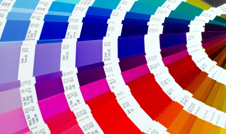
All the above steps were about how to choose the right color palette for your brand. If you are still unclear about the colors, you can look into the color wheel and choose the one that suits your brand best. After finalizing the color palette, ensure that you maintain the brand identity by keeping the palette consistent all around branding, digital, and print media. Keep uniformity across all channels to make your brand recognizable and memorable.
Conclusion
The power of color palettes in digital marketing is beyond its presence as a visual element. By understanding color psychology and choosing the right palette, you can create strong branding that resonates with your target audience. Whether you are about to launch a new brand or considering rebranding, understanding color psychology can help you leave a long-lasting impact on your consumers.